Blog » Post
Knowledge Base Redesign: RealNetworks
Back in the spring, we worked with the folks at RealNetworks to redesign all five of their support knowledge base sites, for: RealPlayer, Subscriptions from Real / SuperPass, RealArcade, GameHouse and Rhapsody. (Note: RealNetwork's ownership in some of these products / sites has changed since we originally worked on the KBs.)
Before we worked on them, the sites had been designed and built with mostly a very utilitarian ethic and "techie" look and feel. RealNetworks was excited to have the opportunity to improve the design on all fronts: branding, visual appeal, friendliness, usability, readability, findability, information / task flow and overall clarity.
We had a number of branding constraints we were given, in terms of the way the sites needed to tie into the global "Real" brand, yet be distinct from the "main" sites. The KB sites also needed to be visually compatible, but distinct from each other, as well.
We ended-up taking two different approaches: for one set of sites, there was a support portal type page design, and this then connected to the RealPlayer, Subscriptions, RealArcade and (at the time) Rhapsody KB designs—four very compatible KB designs, and a fifth design for a compatible portal page.
Then the GameHouse brand looks totally different, and required a totally different approach. In this case, we had to match their site design very closely such that the KB would work seamlessly in relationship to their "main" site.
Below are some examples:
An "answer" page, for the RealPlayer site:

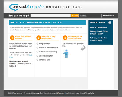
A "contact" page, for the RealArcade site:

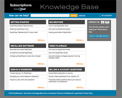
The main landing page, for the Subscriptions site:

As you would imagine, this kind of support knowledge base serves as an important resource for customers when they need help using these products and services. The knowledge base (articles / answers) portion of the site is also integrated into a full Customer Relationship Management (CRM)-type system where people can chat or ask questions of customer and technical support staff.
So, in our design work, we looked at how the sites would communicate, in a friendly and clear manner, when and how customers could and should connect with support staff.
As part of this, we designed and built an interactive "wizard" interface on the contact page, that helps customers select the right channel and mechanism for contact. There are several choices that depend on things like the type of question, the type of account the customer has, and the time of day—and it's very important to both customers and the support staff that they be matched up correctly.
We also built and implemented our design, doing all of the front-end coding in HTML and CSS, and some key Javascript for the contact wizard. The KBs are built on RightNow Technologies Customer Portal, CRM / KB platform, and we created some extensively customized "widgets"—which are the components that connect the user interface / webpages to the back-end in the Customer Portal (CP).
In creating these widgets, we worked extensively in the underlying technologies in CP, which include CodeIgniter and YUI Library.
With our experience in branding, information architecture, customer service and knowledge management, we were happy to have the opportunity to design and build so many aspects of these KBs. And, we look forward to doing other RNT CP-based KBs in the future, as well!
Blog Archives
Next post: Site Launch: Author Sean Beaudoin
Prev post: Site Launch: Secrets of People Who Never Get Sick